User problem
TPG’s core audience is made up of people looking for simple, affordable mobile and internet products. But the website’s navigation didn’t reflect that – it was cluttered with duplicate links, vague labels, and the mobile experience was especially poor.
My role
I was part of a cross-functional team that included a visual designer, software engineer, and iteration manager. During discovery and prioritisation, we agreed to focus on improving the UX content rather than doing a full design overhaul.
I led the information architecture planning, user testing, and UX writing for the project – streamlining navigation, clarifying labels, and making the experience more intuitive and user-friendly.
Discovery
I began the project by digging into key areas that would inform our UX and content strategy:
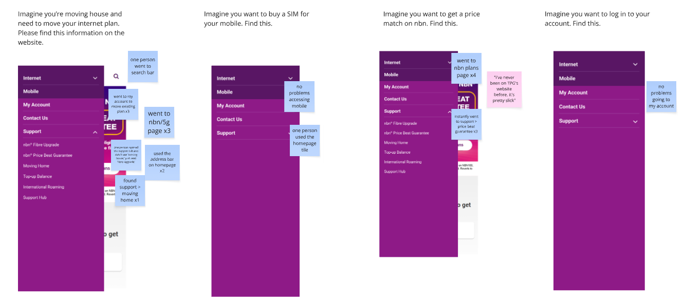
- Usability testing and analytics – to understand how users were interacting with the current navigation and where they were getting stuck
- Competitor analysis – to identify best practices and opportunities for differentiation
- Business needs and priorities – to ensure the navigation supported both user goals and strategic objectives
This groundwork helped us shape a navigation experience that was more intuitive, purposeful, and aligned with both user and business needs.


Iteration
After identifying key priorities – including user pain points, top user tasks, and business goals – I began drafting the new navigation structure. With 75% of TPG’s traffic coming from mobile, we made mobile usability a top priority. That meant no more long, confusing labels.
I took the opportunity to refine link labels, making them clear, concise, and aligned with what users were actually looking for. To validate our approach, I conducted three rounds of user testing, including tree testing and card sorting, which helped us fine-tune the structure and ensure it was intuitive for users.


Outcomes
The new navigation that we launched showed an increase in overall useability by ~22% in user testing. Live analytics are pending.


Leave a Reply